class: center, middle, inverse, title-slide # Visualization- Some aspects of ggplot2 --- class: inverse, middle, center class: inverse, middle, center # Combine multiple graphs with the same aes --- ```r library(tidyverse) library(knitr) library(ggplot2) df <- read_csv('../data/all-states-history.csv') df <- df %>% filter(deathIncrease>0, positiveIncrease>0, date<'2021-01-01') library(lubridate) df <- df %>% filter(positiveIncrease>0) %>% mutate(year = year(date), quarters = quarters(date), month = month(date, label = TRUE), day = wday(date), day_type = case_when(day < 6 ~ 'weekday', TRUE~'weekend')) ``` --- ```r df %>% ggplot()+ geom_point(mapping=aes(x=positiveIncrease, y=deathIncrease, color=quarters))+ geom_smooth(mapping=aes(x=positiveIncrease, y=deathIncrease, color=quarters)) ``` 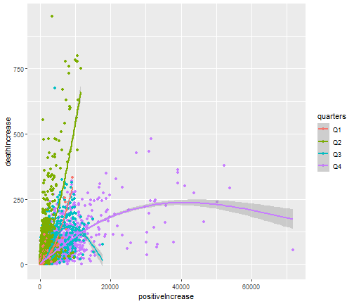<!-- --> --- ```r df %>% ggplot(mapping=aes(x=positiveIncrease, y=deathIncrease, color=quarters))+ geom_point()+ geom_smooth() ``` <!-- --> --- class: inverse, middle, center # Facets --- ```r df %>% filter(month=='Apr'|month=='Jul') %>% ggplot(mapping=aes(x=positiveIncrease, y=deathIncrease))+ geom_point()+ geom_smooth()+ facet_wrap(~month) ``` 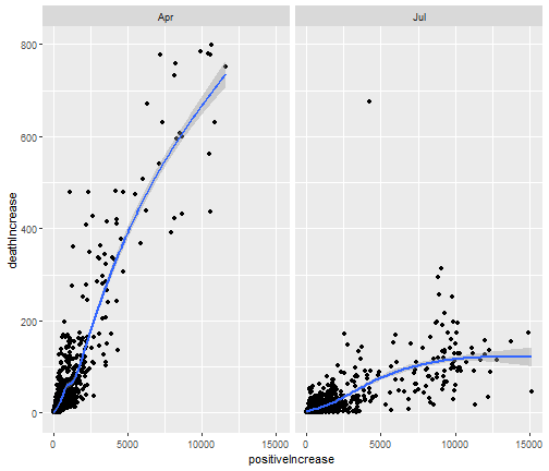<!-- --> --- ```r df %>% ggplot(mapping=aes(x=positiveIncrease, y=deathIncrease, color=quarters))+ geom_point()+ geom_smooth()+ facet_wrap(quarters~day_type) ``` 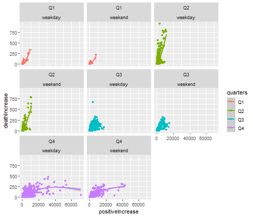<!-- --> --- class: inverse, middle, center # Position adjustments --- ```r df %>% filter(state=='RI') %>% ggplot()+ geom_bar(mapping=aes(x=quarters, fill=day_type), position = 'dodge') ``` 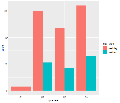<!-- --> --- ```r df %>% filter(state=='RI') %>% ggplot()+ geom_bar(mapping=aes(x=quarters, fill=day_type), position = 'fill') ``` 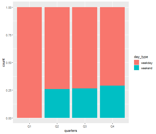<!-- --> --- class: inverse, middle, center # geom_bar vs. geom_col --- **geom_bar** ```r df %>% ggplot()+ geom_bar(mapping=aes(x=quarters)) ``` 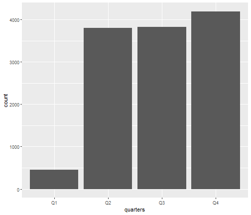<!-- --> --- **geom_col** ```r df %>% group_by(quarters) %>% summarise(average_positive=mean(positiveIncrease)) %>% ggplot()+ geom_col(mapping=aes(x=quarters, y=average_positive)) ``` 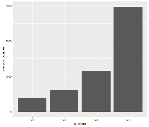<!-- --> --- class: inverse, middle, center # Correlogram --- ```r library(ggcorrplot) df_cor <- df %>% select(deathIncrease, hospitalizedIncrease, positiveIncrease, negativeIncrease, totalTestsViralIncrease, totalTestResultsIncrease, totalTestEncountersViralIncrease) corr <- df_cor %>% cor ggcorrplot(corr, hc.order = TRUE, type = "lower", lab = TRUE, lab_size = 3, method="circle", colors = c("tomato2", "white", "springgreen3"), title="Correlogram", ggtheme=theme_bw) ``` 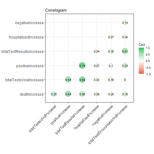<!-- --> --- ```r data(mtcars) corr <- round(cor(mtcars), 1) ggcorrplot(corr, hc.order = TRUE, type = "lower", lab = TRUE, lab_size = 3, method="circle", colors = c("tomato2", "white", "springgreen3"), title="Correlogram", ggtheme=theme_bw) ``` 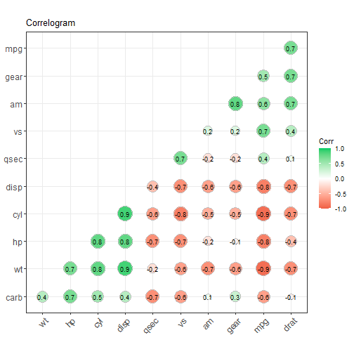<!-- --> --- - For more: http://r-statistics.co/Top50-Ggplot2-Visualizations-MasterList-R-Code.html --- class: inverse, middle, center # Labels/Title --- ```r df %>% filter(month=='Apr'|month=='Sep') %>% ggplot()+ geom_point(mapping=aes(x=positiveIncrease, y=deathIncrease, color=month))+ labs(x='Number of Positive Case', y = 'Number of Death', color='Month of the Year', title = 'Scatter Plot of Positive Cases and Deaths', caption = 'April appears to be more deadly than September.') ``` --- 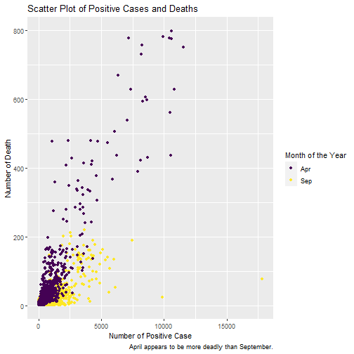<!-- --> --- ```r df %>% filter(month=='Sep') %>% ggplot()+ labs(x='Number of Positive Case', y='Number of Death')+ geom_point(mapping=aes(x=positiveIncrease, y=deathIncrease)) ``` 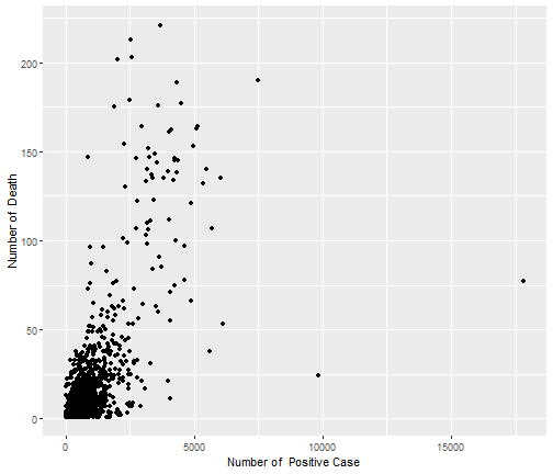<!-- --> --- class: inverse, middle, center # Change Themes --- ```r df %>% filter(month=='Apr'|month=='Jul') %>% ggplot(mapping=aes(x=positiveIncrease, y=deathIncrease, color=month))+ geom_point()+ geom_smooth()+ facet_wrap(month~day_type) ``` 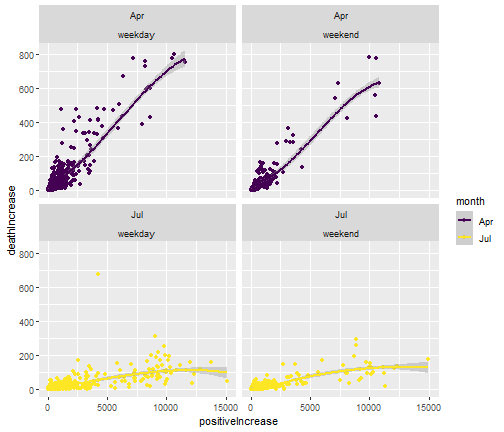<!-- --> --- ```r df %>% filter(month=='Apr'|month=='Jul') %>% ggplot(mapping=aes(x=positiveIncrease, y=deathIncrease, color=month))+ geom_point()+ geom_smooth()+ facet_wrap(month~day_type)+ theme_dark() ``` 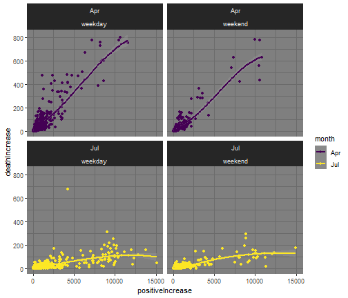<!-- --> --- ```r df %>% filter(month=='Apr'|month=='Jul') %>% ggplot(mapping=aes(x=positiveIncrease, y=deathIncrease, color=month))+ geom_point()+ geom_smooth()+ facet_wrap(month~day_type)+ theme_linedraw() ``` 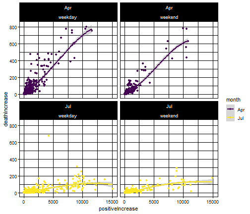<!-- --> --- # More Themes - https://ggplot2.tidyverse.org/reference/ggtheme.html --- **`ggthemes` package** ```r library(ggthemes) df %>% filter(month=='Apr'|month=='Jul') %>% ggplot(mapping=aes(x=positiveIncrease, y=deathIncrease, color=month))+ geom_point()+geom_smooth()+facet_wrap(month~day_type)+ scale_color_stata() ``` 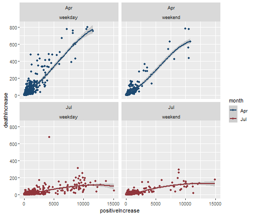<!-- --> --- **Save plots** ```r gg <- df %>% group_by(quarters) %>% summarise(mean=mean(positiveIncrease)) %>% ggplot()+ geom_col(mapping=aes(x=quarters, y=mean)) ggsave(filename = 'abc.png', plot = gg) ```