[Link to the plot](abc.png)Assignment 7 - Visualization - Some aspects of ggplot2
How to do it?:
Open the Rmarkdown file of this assignment (link) in Rstudio.
Right under each question, insert a code chunk (you can use the hotkey
Ctrl + Alt + Ito add a code chunk) and code the solution for the question.Knitthe rmarkdown file (hotkey:Ctrl + Alt + K) to export an html.Publish the html file to your Githiub Page.
Submission: Submit the link on Github of the assignment to Canvas
Use the data of your own. Produce the following types of plots and comment on each plot. Plots should be meaningful. If you use the data we used in class, make sure the plots are not the same as the ones in the slides. All plots should have title, caption, appropriate labels on x and y-axis.
Make a plot using
facet_wrapby one categorical variable (facet_wrap(~variable1))Make a plot using
facet_wrapby two categorical variables (facet_wrap(~variable1+variable2))Make a plot using
position ='dodge'.Make a plot using
position ='fill'.Make a plot using
geom_col.Change the theme of one of your plots.
Make a plot using combo filter + ggplot
Make a plot using combo group_by + summarise + geom_col
Save a plot and put a link of the plot to your Github Webpage. To link a plot
abc.pngyou just need to insert the following on the README.md
- In this question, we will use the Covid19 vaccination data for the US. The data and data dictionary can be found at the below link:
library(tidyverse)
df <- read_csv('https://bryantstats.github.io/math421/data/vaccinations-by-manufacturer.csv')
Geom_point makes scatter plots, which plot two numeric (or Date) variables. A third categorical variable is often brought in for color. For example, we can compare different vaccine types used in the US by
df %>%
  filter(location=='United States') %>%
  ggplot()+
  geom_point(mapping = aes(x = date,
                                    y = total_vaccinations,
                                    color = vaccine))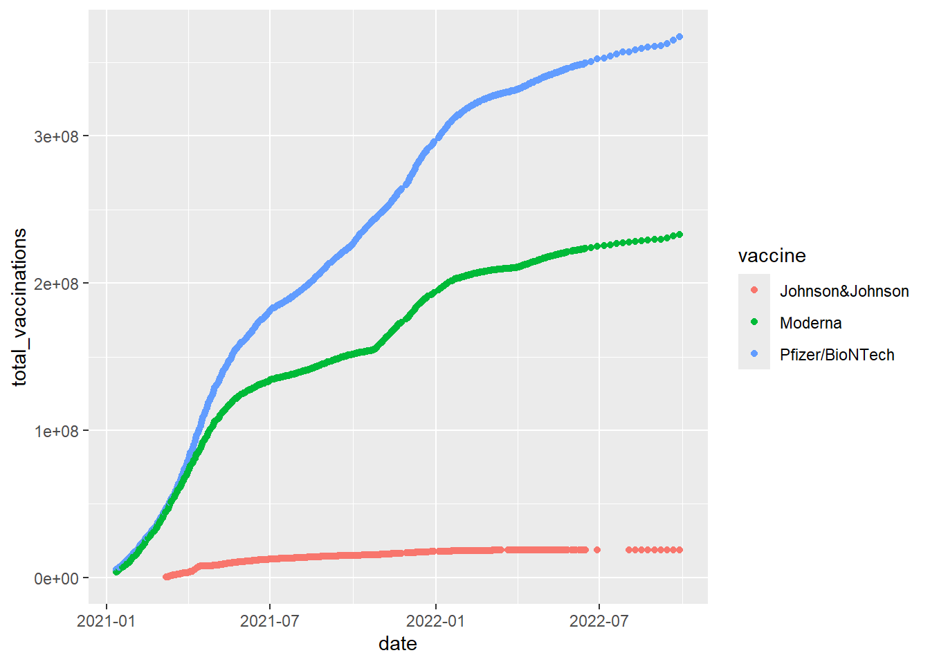
Do the follows.
Use
geom_pointto compare the vaccines used by date in Argentina in 2022.Change
geom_pointtogeom_linein the above codes to have the corresponding line plots.
- (Using the same dataset as in 10.) Sometime we need to do some calculations on the data before plotting. For example, the below codes is to compare the total vaccines (including all types of vaccines) by date between the US and the EU
# the total vaccines (including all types of vaccines) by date
d1 <- df %>%
  filter(location %in% c('United States', 'European Union')) %>%
  group_by(date, location) %>%
  summarise(total_vac2=sum(total_vaccinations, na.rm=TRUE))

# Plot
d1 %>%
  ggplot()+
  geom_point(mapping=aes(x=date,
                         y=total_vac2,
                         color=location))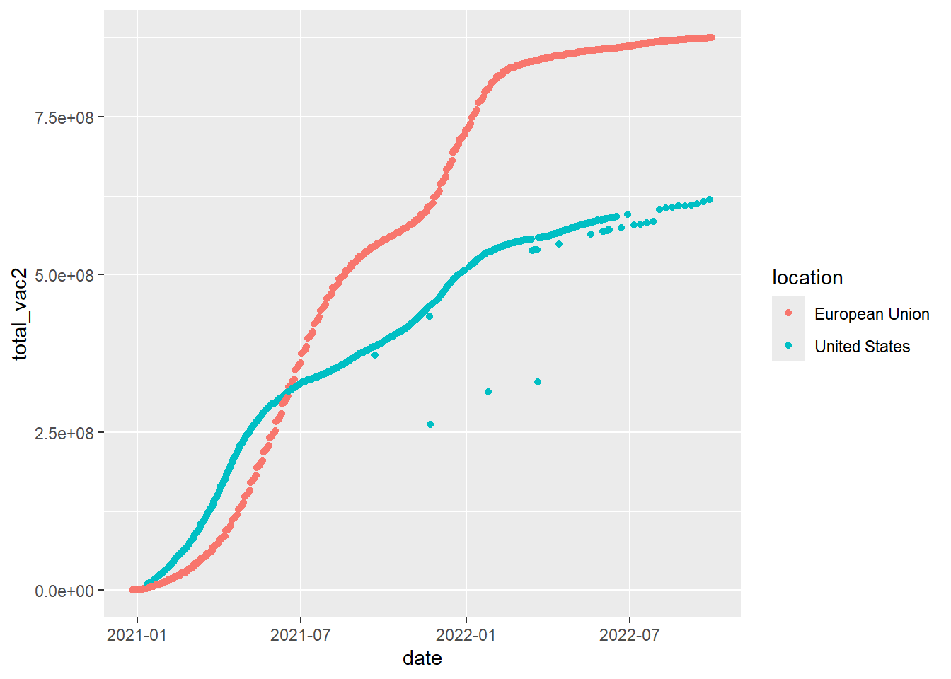
Notice that the above codes could be piped in one
df %>%
  filter(location %in% c('United States', 'European Union')) %>%
  group_by(date, location) %>%
  summarise(total_vac2=sum(total_vaccinations, na.rm=TRUE)) %>%
  ggplot()+
  geom_point(mapping=aes(x=date,
                         y=total_vac2,
                         color=location))
Do the follows.
Use
geom_pointcompare the total vaccines (including all types of vaccines) by date between countries/regions in AsiaUse
geom_pointcompare the total vaccines (including all types of vaccines) by date between countries/regions in South America in 2021